
I’ve posted a lot lately about how we’re reducing down all your bubble drawings into one amazing catalogue of bubbles. However you also draw many other things onto the MWP image, such as green knots, red fuzzies, galaxies, star clusters and more. Unlike the bubbles, which require careful elliptical annuli to be drawn, these other objects are simply marked with an approximate box. This makes combining all of the different boxes much simpler than combining bubbles.
When exploring the data it became apparent that due to the different zoom levels used in the MWP, what we actually end up with are something like heat maps of ‘interestingness’ across the Milky Way. Users drawing on the low zoom levels draw broader, less-accurate boxes because they are constrained by low image resolution, users on the highest zoom level draw very precise images and may draw multiple regions within the same larger box. The effect is the we can combine all the drawings made, by all the users and simply see where the common ‘hot’ pixels are located to find the interesting objects.
This all becomes very with an example. Below is one of my favourite regions around 19 degrees longitude:
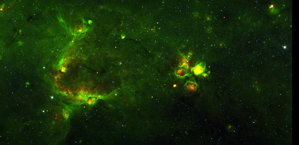
Now let’s look at the map of all the boxes that users drew to denote fuzzy red objects. Each user drawing is show with a little transparency, at 20% opacity. In this way, if 5 users drew over the same pixel, it will appear white.

You can see that the Milky Way Project volunteers are collectively very good at marking where the red emission lies. We can look at this result in a better, more useful way though. If we use the second image to mask the original one then we strip out the areas we aren’t interested in and just see all the fuzzy red objects. This subtraction is shown below:

Of course, users mark all sorts of interesting things in these images. So let’s take a look at this region on a per-object basis. First let’s look at the green knots – the bright green emission that shows us where there may be young stars or other star-formation activity:

You can see that the red fuzzies and the green knots often sit right next to other. Next let’s see where the dark nebulae are:

You can tell here that using a box doesn’t work so well with the dark nebulae, because they are so long and windy. This is one area where we could improve the interface for the second-generation of the Milky Way Project. Perhaps we could offer volunteers a paintbrush tool instead? Now let’s look at the star clusters:

and the galaxies (there are only two of them it seems):

There is also the ‘other’ category, designed to catch anything else:

It’s great to see that on this ‘other’ image we see a lot of the #yellowballs that were talked about on Milky Way Talk.
Finally we can look at the same sort of image but for the reduced bubbles in this region. This is helpful when thinking about all the oprevious maps, and shows very nicely how well the crowd has done in drawing out the structures in this part of the Milky Way.

We say in all our text around the site that we want you to help us measure and map the galaxy. It seems that not only are you capable of doing just that, but you do it very well! Well plan to publish full catalogue papers of all of these types of interesting objects, for the whole of the GLIMPSE survey.


